


For those of you who have spent some time using Squarespace, you've likely noticed that we pride ourselves in always paying attention to the little details. Details in the design of our website, details in the design of our platform, and even the details in the design of our slick little Squarespace favicon.
We admired the icon design work of the team at Techlogica, and when they approached us with the idea of refining our favicon, we were anxious to see what they would come up with.
We asked Techlogica's Kyle White to share a bit about his motivation as well as the icon design process:
"Squarespace always struck us as a high quality, next-gen web design framework (as it likely does for most).
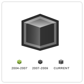
However, we noticed the favicon being used didn't make use of the alpha channel, and was 15 pixel on one dimension (itwas an ICO with a 15x16 inner icon entry of type 32bit XP format). This left it up to the browser itself to either resample it, or show it 1:1. While the cube being shown is the best object to represent the framework, we thought there could be some areas for improvement.
The newly designed icon is still a black cube, but we made use of the full 16x16 canvas, shading all three visible sides with different gradient fills. You'll notice an inner stroke drawn at about a 30% opacity value over the inner shape, as well as an outer border of a dark gray tone. The edges of the icon are anti-aliased as well. All in all, we think the result is a more modernized take on what was already a great idea, and we believe it suits the Squarespace framework well."
Agreed--we all love it too!
You can see the progression of the Squarespace favicon designs in the image above. What do you guys think?