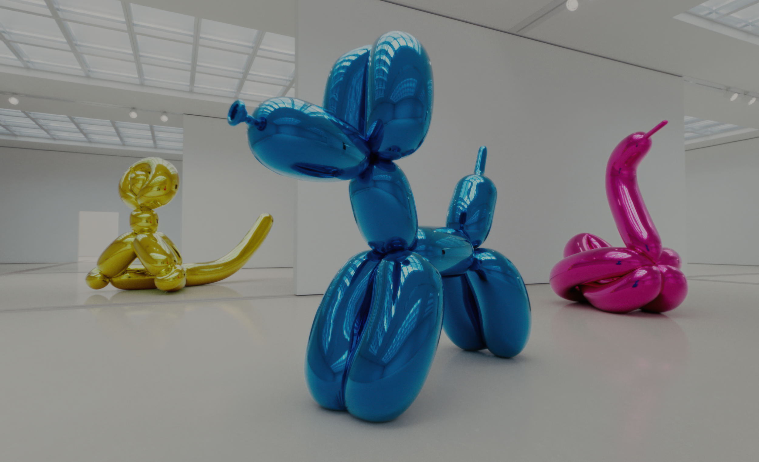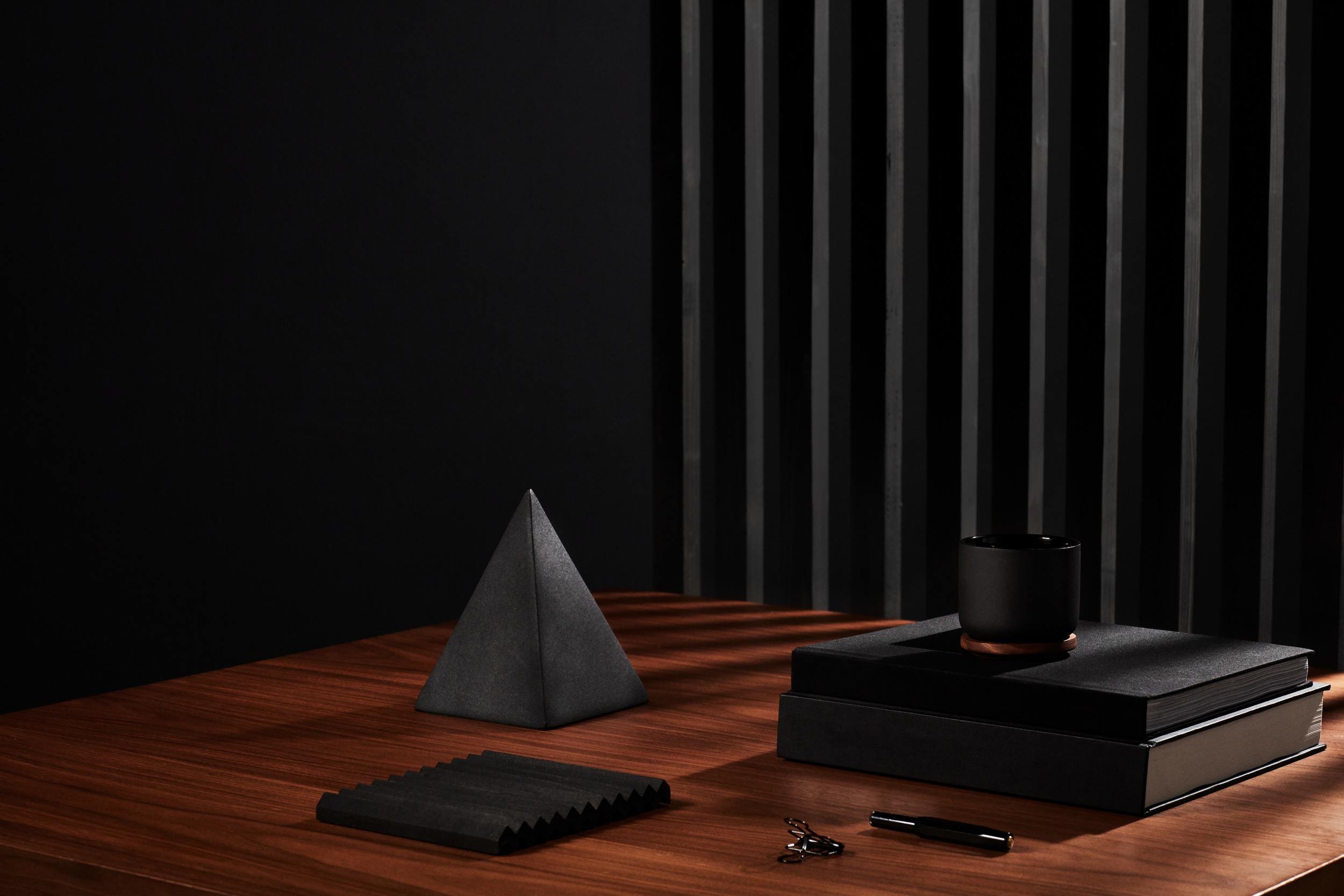
Meet Beatrice, the newest design available in our template collection.
Beatrice was designed with two core values in mind: symmetry and balance. The design places equal weight on the width of your blog’s sidebar and metadata column, so that the content always looks well balanced and clean. Subtle touches, such as borders on the top and bottom of a page (as well as between posts), anchor the content and hold it together nicely to give your site a structured feel.
It’s delightfully easy to set up your website with Beatrice. Simply add a header image and content, and you’re good to go. As with all Squarespace designs, there are a number of customization options to make Beatrice your own. Header images can be customized per page, and you can change the site title placement to work with your chosen image.
Have any specific questions regarding Beatrice? Join the Squarespace Hangout next Wednesday for a special tour of Beatrice with its designer, Cheryl Yau.
Enjoy!


