Awhile back, we added per-author wrapping div's so that you could style entries based on the author of the post. Along with that, we snuck out wrappers for per-author comments as well.
In the new blog re-design, I chose to take advantage of those wrappers and am going to give you a quick write up on how to do it on your own site.
Here is what a comment wrapper looks like that was authored by me (Tyler).
....
For reference, if I had another author on my blog named Mark, his would be ...authored-by-mark.
So to target my comments and style it differently, here is what I did:
/* TYLER */
.comment-wrapper.authored-by-tyler { background: url(/storage/layout/icon-tyler50.png) no-repeat 0 8px; padding: 0 0 0 75px; } /* comments */
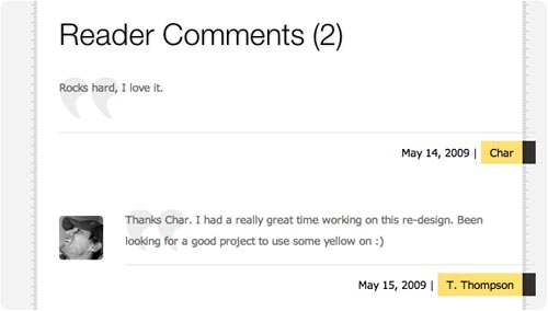
This puts my icon next to the left of my comment and pads it accordingly (see below):

What I did in terms of styling was really basic, but with the per author wrapper encompassing everything in the comment (signature included), you could do anything you want style-wise to just my specific comments.
For instance, if I wanted to make the actual body copy of my comment green and 30px, it would look like this:
/* TYLER */
.comment-wrapper.authored-by-tyler .body { color: #00ff00; font-size: 30px; } /* comment body text */
Likewise, if you want to give all unregistered commenters an icon, you can style them like so:
/* UNREGISTERED COMMENTER */
.comment-wrapper.authored-by-none { background: url(/storage/layout/icon-unreg50.png) no-repeat 0 8px; padding: 0 0 0 75px; } /* comments */
Hope this helps you further customize your Squarespace site with a bunch of nice little touches.


